Objective
Teach how to add and configure a floating button on your website using the platform’s native feature, ensuring proper functionality on both desktop and mobile.
Target Audience
Beginner to intermediate users who want to add a fixed on-screen button, such as WhatsApp or quick contact.
Overview
The builder includes a native floating button feature. This button stays fixed on the screen and automatically adjusts to the visitor’s device size.
It can be configured with:
link or contact number
optional message
screen position
size
opacity
shadow
entry effect
tag for script integration
Once configured and saved, the button works automatically on both desktop and mobile.
Step-by-step
1. Access builder elements
Inside the page builder:
click Add elements
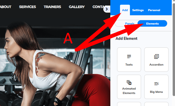
on the right-side menu, scroll to Floating Button
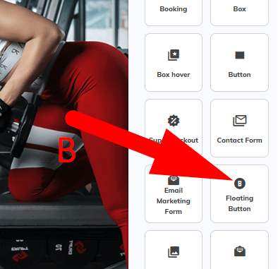
2. Select the floating button
Choose one of the available models.
Common example: WhatsApp button.
3. Open settings
Right-click on the inserted button.
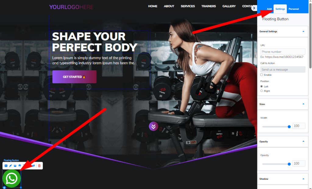
This opens the configuration panel.
4. Configure link or number
For WhatsApp:
enter the number following the example URL format
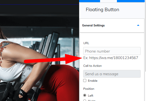
This step is critical for proper functionality.
5. Enable optional message
You can display a message next to the button.
Example:
Send us a message
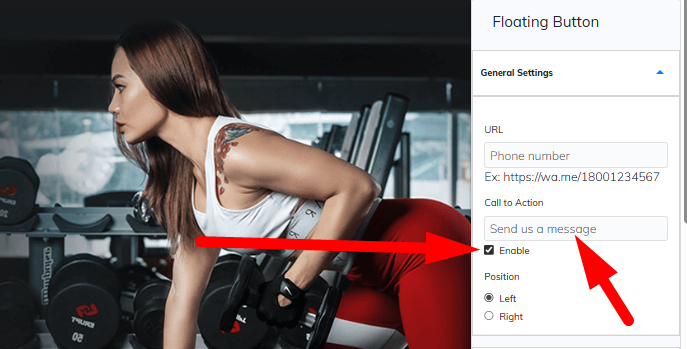
The text can be customized as needed.
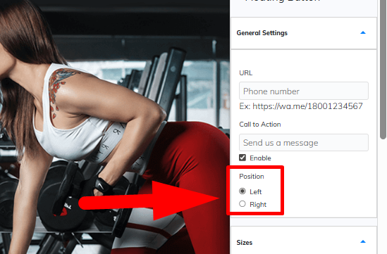
6. Define button position
Choose where it appears:
left side
right side
7. Adjust size
Use the size setting to control the button dimensions.
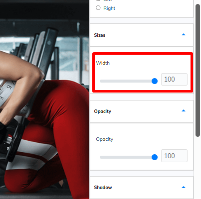
This directly impacts visibility and usability.
8. Adjust opacity
Control the transparency level.
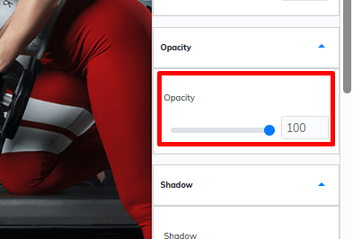
Use it to make the button more subtle or more prominent.
9. Configure shadow and entry effect
You can customize:
button shadow
entry animation
These improve visual impact.
10. Configure tag (optional)
You can assign a tag to the button.
This tag can be linked to JavaScript in the page script settings for advanced integrations.
11. Save
Click Save.
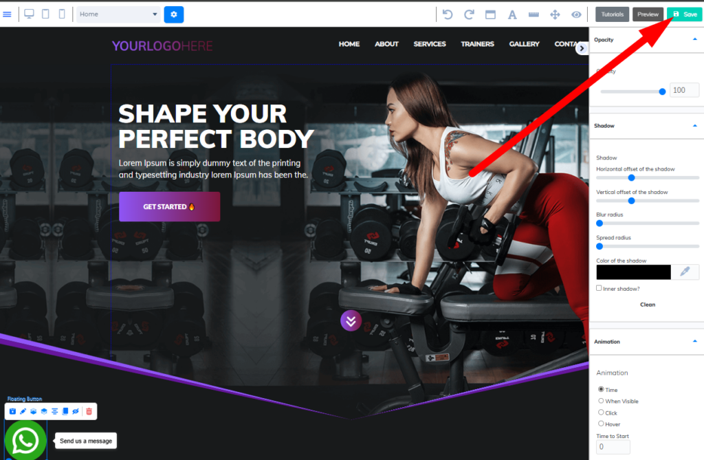
The button will be active on your page.
Desktop and mobile behavior
The floating button has automatic positioning.
This means:
it follows the configured position
it adapts to screen size
it works on both desktop and mobile without extra setup
Practical tips
Use the native floating button for automatic responsiveness
Always verify the configured link or number
Avoid oversized buttons that affect usability
Test on desktop and mobile before publishing
FAQ
Does it work automatically on mobile?
Yes. It adapts to screen size automatically.
Can I choose where it appears?
Yes. You can set left or right.
Can I change the size?
Yes. There is a specific setting for that.
Can I add a message next to it?
Yes. It can be enabled and customized.
Can I integrate it with scripts?
Yes. Using the tag configuration.
Troubleshooting
Button is not showing
Make sure you clicked save
Confirm the button is added to the page
WhatsApp button not working
Check the number and URL format
Button in wrong position
Verify selected side
Test on different screen sizes
Incorrect size
Adjust the size setting accordingly
Summary
The native floating button is the simplest and most efficient way to add a fixed button to your website.
It automatically adapts to both desktop and mobile without requiring additional configuration.